Auto Layout: think like a developer
A hand-placed mockup shows a screen at one size. A design built with Auto Layout describes how that screen behaves when the content or the width changes. The second one is what developers will actually write. You might as well build it with their logic from the start.
Auto Layout is flexbox
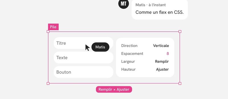
Figma’s Auto Layout mirrors flexbox, the most widely used layout system on the web, almost term for term. Knowing that mapping changes the way you build.
- Direction (horizontal or vertical) maps to the main axis of a flex container.
- Spacing between items maps to the gap the code applies between children.
- Padding maps to the container’s padding.
- Alignment maps to how children are placed along each of the two axes.
- Wrap maps to a container that moves items to a new line when it runs out of room.
So when I build a block, I ask the question a developer would ask: what is the container, which direction do its children stack in, and with what gap. If I can’t answer, the structure isn’t clear, and it won’t be any clearer in code.
Fill, hug, fixed: three behaviors to choose from
Every element inside an Auto Layout has a width behavior and a height behavior. It’s the most important setting, and the one most often left to chance.
Hug contents. The element takes the size of what it contains. It’s the right choice for a button, a tag, a short piece of text: they should grow with their label.
Fill. The element takes up all the available space in its parent. It’s the right choice for a form field, a card in a column, a long text that needs to wrap.
Fixed. The element keeps a set size no matter what. I save it for elements that have a real reason to be locked: an icon, an avatar, a thumbnail.
My rule: fixed is an exception that has to be justified. A fixed element with no reason behind it will overflow or leave a gap the day the content changes. When I review a file, every fixed size is a question to ask.
Two settings round out these three behaviors: a min width and a max width. Text that fills its column becomes unreadable on a large screen without a max width. A button that hugs its label looks ridiculous without a min width.
A flat hierarchy
With Auto Layout, the temptation is to nest. One frame to align two elements, another around it to add padding, a third to center the whole thing. You end up with a stack of containers that each do almost nothing.
Code doesn’t like that, and neither does Figma. Every extra level is one more place where a setting can contradict the one next to it.
Here’s how I keep the hierarchy shallow:
- One container, one reason. Each frame groups elements that stack in the same direction. If it holds a single child and only exists to add padding, that padding belongs to the parent.
- Spacing on the container, not the children. The space between two elements comes from the parent’s gap, not from empty frames slipped in between.
- No hand-placed elements inside an Auto Layout. Absolute positioning exists, and it has its uses: a badge on the corner of an image, for example. Anywhere else, it points to an element the system isn’t handling.
- A reasonable number of levels. When I have to expand more than four or five levels to reach a text layer, I go looking for the useless container.
A flat hierarchy has a direct payoff: a developer inspecting the design finds the structure they’re about to write, without having to reconstruct it.
Spacing comes from variables
In an Auto Layout, gap and padding aren’t typed in by hand. They come from the file’s spacing variables.
That’s what makes the system consistent: every card has the same padding because they all use the same variable, not because someone remembered to type the same value. And it’s what makes modes useful: when the variable changes between mobile and desktop, every container adapts on its own.
A value typed by hand in an Auto Layout is the most reliable sign that a block was built outside the system.
Name layers like code components
Figma names layers on its own: “Frame 12,” “Frame 13,” “Rectangle 4.” Those names cost nothing to leave, and they cost a lot to everyone who opens the file afterward.
I rename each container after its role in the structure:
- by function, not appearance: “header,” “content,” “actions,” rather than “gray block” or “left column”;
- using the same words as the code when they already exist: if developers talk about a card header, that’s what the layer is called;
- no numbers: if two sibling layers need a number to tell them apart, they probably have two different roles worth naming;
- text layers by the kind of content they hold: “title,” “description,” “price,” so it’s clear what varies.
A well-named file can be read without opening it layer by layer. It’s also what lets a tool, human or automated, turn it into code without guessing.
Test before handing off
You don’t check an Auto Layout by looking at it. You check it by pushing it around. Before I consider a component or block done, I put it through four tests:
- I make it wider and narrower. Nothing should overflow, overlap, or leave an odd gap.
- I double the text length. A three-line title, a button with a long label, an endless proper name.
- I empty the content. Missing text, a missing image, a list with no items.
- I switch modes. Going from desktop to mobile should happen through variables, without touching the block.
If the block survives these four tests, it will hold up in code. If it doesn’t, the developer will find the problem for me, at the worst possible time.
What it changes in working with developers
Building with Auto Layout isn’t about keeping developers happy. It’s about closing the gap between what I design and what gets built.
When the design already describes containers, directions, gaps, and behaviors, the conversation changes. We’re no longer debating how to interpret a picture. We’re discussing choices: should this text wrap or be truncated, should this column keep a min width. Those are real design decisions, and they’re mine to make.
In short
Think of every block as a flex container. For each element, choose between fill, hug, or fixed, and justify every fixed one. Keep the hierarchy flat, spacing in variables, and layers named the way they are in code. Then push the result around before handing it off. A design built this way doesn’t need translating: it reads on its own.