Accessibility: the minimum you can’t miss
Accessibility isn’t a layer you add at the end of a project. It’s a small set of rules that, applied from the start of design, make a product usable by many more people. Here’s the minimum I check on every screen, and how to verify it without being an expert.
Why start with the minimum
Accessibility guidelines are long, and their length is discouraging. Yet a large share of the problems on websites and apps comes from the same mistakes over and over. Seven rules applied everywhere beat a hundred rules everyone knows and nobody applies.
These rules aren’t only for people with disabilities. Good contrast is easier to read in direct sunlight. A large target is easier to tap one-handed. A clear form saves everyone time. Accessibility is first and foremost a quality standard.
1. Sufficient contrast
The basic rule: body text needs a contrast ratio of at least 4.5:1 against its background. For large text, and for interface elements that carry meaning, like a field border or an icon, the minimum is 3:1.
The traps are always the same:
- light gray on white, picked for secondary text because it “looks clean”;
- text placed over a photo, readable on one part of the image and not the other;
- placeholder text in a field, often too faint to read.
A related rule: information should never rely on color alone. A field with an error doesn’t get by with a red outline. It also shows an icon and a message.
The right place to handle contrast is the design system. I check the allowed color pairs, text on background, once and for all at the variable level, in both light and dark mode. Every screen then inherits them.
2. A visible focus
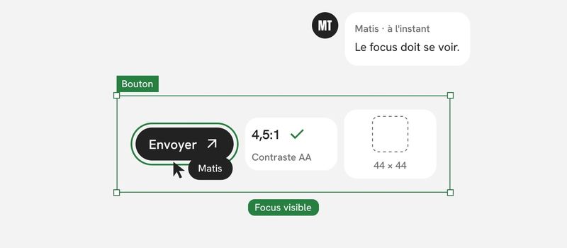
Many people navigate with a keyboard, using the Tab key. For them, the active element must always be visible.
The most common mistake is removing the default focus outline because it’s considered ugly, without replacing it. The page then becomes impossible to use without a mouse.
So I design the focus state as a full-fledged state of every component, just like hover or disabled. It has to be sharp, high-contrast, and consistent from one component to the next.
Two checks complete this rule. The tab order follows the reading order. And no element should trap the keyboard: a dialog that opens must be closable with the Escape key.
3. Useful alt text
An image that carries information needs alt text. That text describes what the image contributes, not what it shows pixel by pixel. For a chart, it sums up the main takeaway.
A purely decorative image, on the other hand, gets an empty alt so screen readers skip it. Describing every ornament just weighs down the experience.
The most often forgotten case is the icon-only button. A cross, a magnifying glass, three dots: visually it’s clear, but without a name, the button is silent. The name describes the action, “Close” or “Search,” not the drawing.
I write this text in the design file. If I don’t, the developer will have to make it up while coding, without the context.
4. Think about screen readers
A screen reader reads the page aloud and lets people navigate it by headings, links, or regions. It doesn’t see the layout. It reads the structure.
What I check:
- a logical heading hierarchy, with a single main heading and no skipped levels;
- identified regions: header, navigation, main content, footer;
- links and buttons that make sense out of context. Ten “Learn more” links in a row say nothing. “View order details” says it all;
- the right element for the right job: a link goes somewhere, a button triggers an action;
- messages that appear without a page reload, like a send confirmation, must be announced.
In the design file, I annotate heading levels and regions. It takes a few minutes and avoids a structure guessed after the fact.
5. Large enough targets
A button that’s too small is hard to hit for someone with a tremor, someone with large fingers, or someone walking with their phone in hand.
The minimum set by the guidelines is 24 by 24 pixels. I aim for 44 by 44 for primary actions. If the visible icon is smaller, the clickable area can still be larger than the drawing.
Spacing matters as much as size. Two targets right next to each other cause errors, especially when one of them is destructive.
6. Understandable forms
Forms account for a good share of the obstacles. Six rules cover most of it:
- Every field has a visible, persistent label. Placeholder text that disappears as you type doesn’t replace it.
- Required fields are marked, by something other than color.
- The expected format is shown before input, not discovered after an error.
- The error message sits next to the field and says what’s wrong and how to fix it.
- Input is never cleared when an error is detected.
- Common fields support autofill: name, address, email, phone.
A form that follows these rules is more accessible. It’s also faster for everyone to fill out.
7. Respect reduced motion
Operating systems offer a setting to reduce motion. Some people turn it on because large movements, zooms, or parallax effects make them nauseous or dizzy.
The browser can read this setting, so the site can too. When it’s on, I plan an alternative: a simple fade instead of movement, or no animation at all. Information should never depend on animation.
Two more rules go with it. Nothing should flash more than three times per second. And any content that moves on its own, like a carousel, must be pausable.
How to check it
None of these checks requires a paid tool.
- The keyboard test. I let go of the mouse and go through the page with Tab, Enter, and Escape. If I get lost or stuck, there’s a problem.
- The contrast checker. You’ll find them as Figma plugins and in browser developer tools. I use one on the design system’s color pairs, then on the special cases.
- Zoom to 200%. The page must stay readable and usable, with no cut-off text and no horizontal scrolling.
- The screen reader. VoiceOver is built into Apple devices, TalkBack into Android, and NVDA is free on Windows. Ten minutes of listening is enough to spot a silent button or a confusing structure.
- The automated audit. Browsers offer audits that catch some of the errors. I use them as a safety net, with a score threshold to meet on every change.
That last point ties into a belief I apply to all my work: an automated check doesn’t get tired and doesn’t make exceptions. But it doesn’t see everything. Alt text can be present and still useless. Manual testing remains essential.
Where it all comes together: components
If these rules are checked screen by screen, they’ll be forgotten by the tenth screen. If they’re built into components, they apply everywhere with no extra effort.
A button whose documentation covers its focus state, a minimum size, and an accessible name. A field with its label, its error message, and its format hint. Color variables whose pairs have been checked. That’s exactly the logic of a design system: solve a problem once, in the right place.
Accessibility isn’t a separate workstream. It’s a property of components, and a habit of checking.